-
The History and Meaning Behind the Disability Pride Flag
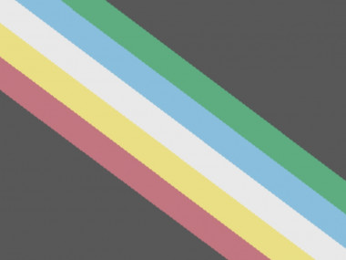
How does the Disability Pride Flag represent the disabled community you ask?The Disability Pride Flag was designed by Ann Magill, a disabled woman, in 2019. With feedback from the disability community, she refined its visual elements to encompass all disabilities.
The shape of the flags’ colorful lines, which represent different aspects of disability, was a lightning bolt, symbolizing the challenges that people with disabilities face and our ability to adapt. It became apparent that this design was dangerous to those who are visually triggered, making it non-inclusive.
As of October 2021, the Pride flag has a new look. The colors have been muted and rearranged to reduce eyestrain and the brightness altered so people with color blindness can distinguish the stripes.
Here’s what each color represents
Black: Mourning and rage for victims of ableist violence and abuse
Green: Sensory disabilities
Blue: Mental illness
White: Invisible and undiagnosed disabilities
Gold: Neurodivergence
Red: Physical disabilities
Did you know the history of the Disability Pride Flag before now? Do you fit into more than one of the color categories?
Sorry, there were no replies found.
Log in to reply.